Why the light spectrum is the ultimate human drug
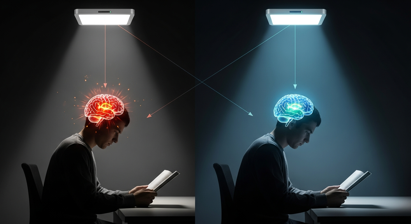
Our understanding of light and its impact on us has deepened hugely during recent years. The research evidence paints a clear picture: two lamps can be the same "brightness" and colour temperature, but it is the spectrum that matters most and we cannot see it with the naked eye.
Here are 10 peer-reviewed research findings from highly respected institutions which illustrate why the spectrum matters. They represent the tip of a large research iceberg now available to help us see, live and feel better under better light.
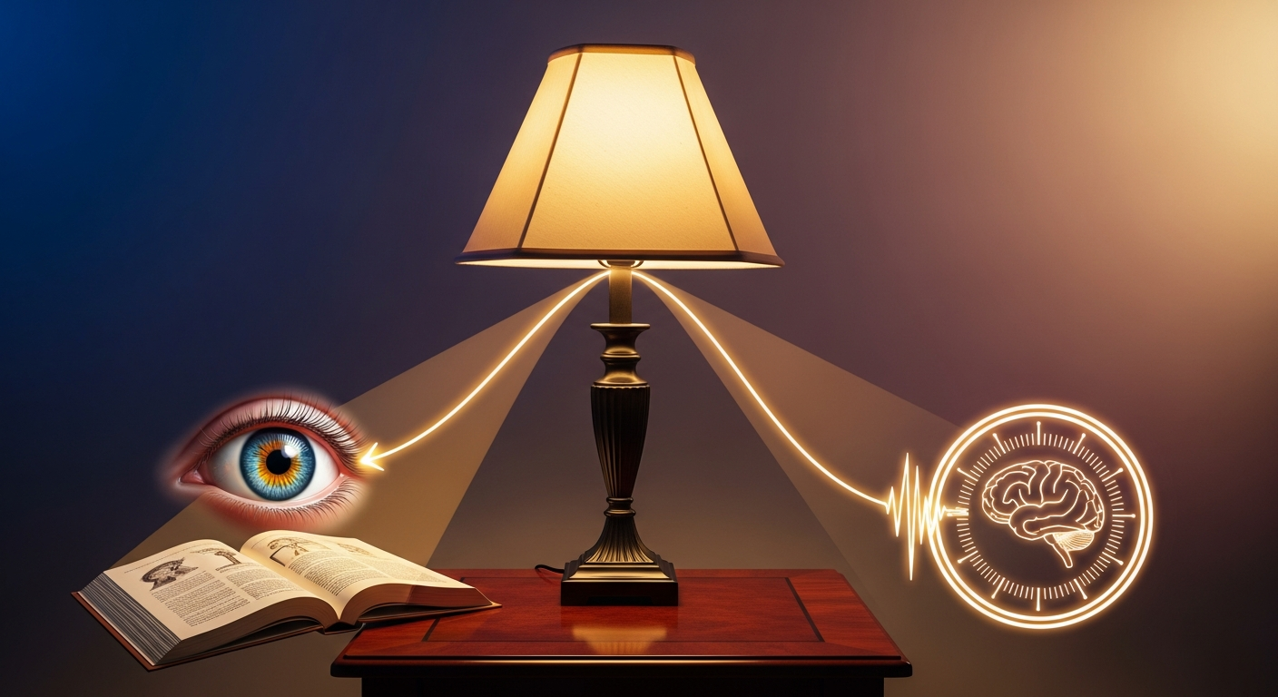
Sight performance

A high fidelity spectrum makes small print snap into focus at the same brightness when it feels "blurred" under a poor quality light.
Reaction times and visual clarity change with according to the spectrum.
Sleep & body clock
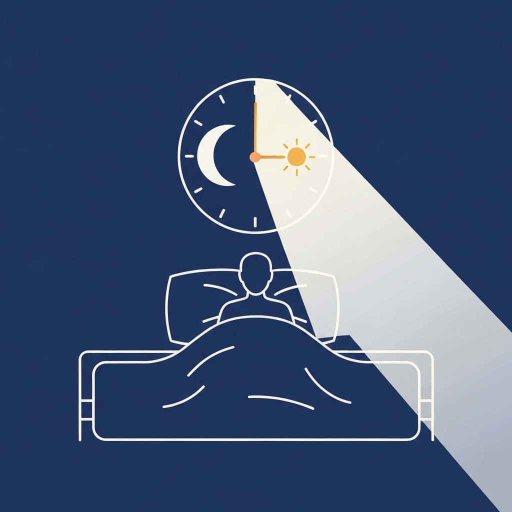
Blue-heavy light at night can reset our body clock causing sleep issues.
The evidence shows that lack of sleep can have major implications on everything from depression to cancer.
Comfort & colour
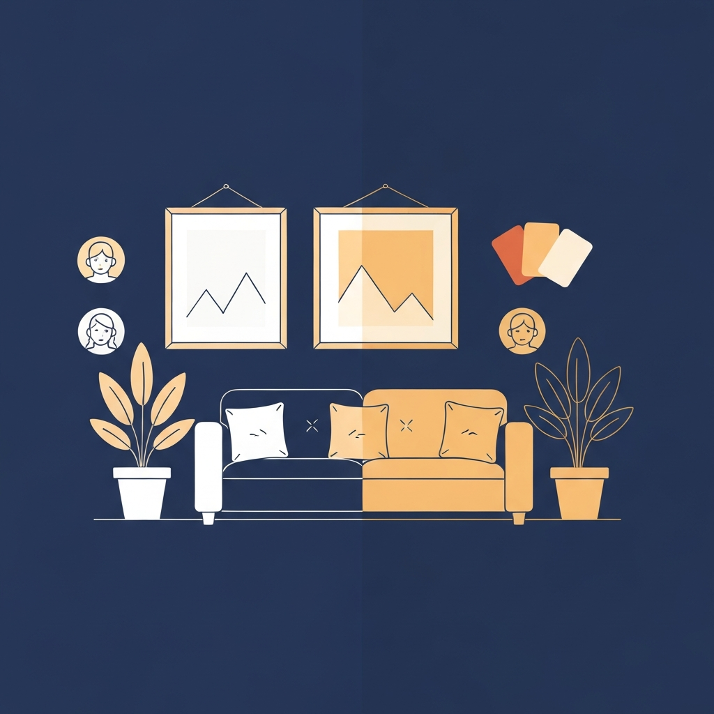
Some spectra can feel harsh and glaring, so you find yourself squinting, rubbing your eyes and rereading the same line over.
A more balanced spectrum keeps colours honest and details calm, so your eyes don't feel drained by the light.
Highly respected, peer-reviewed research evidence shows that the spectrum directly affects how we see, sleep and think.
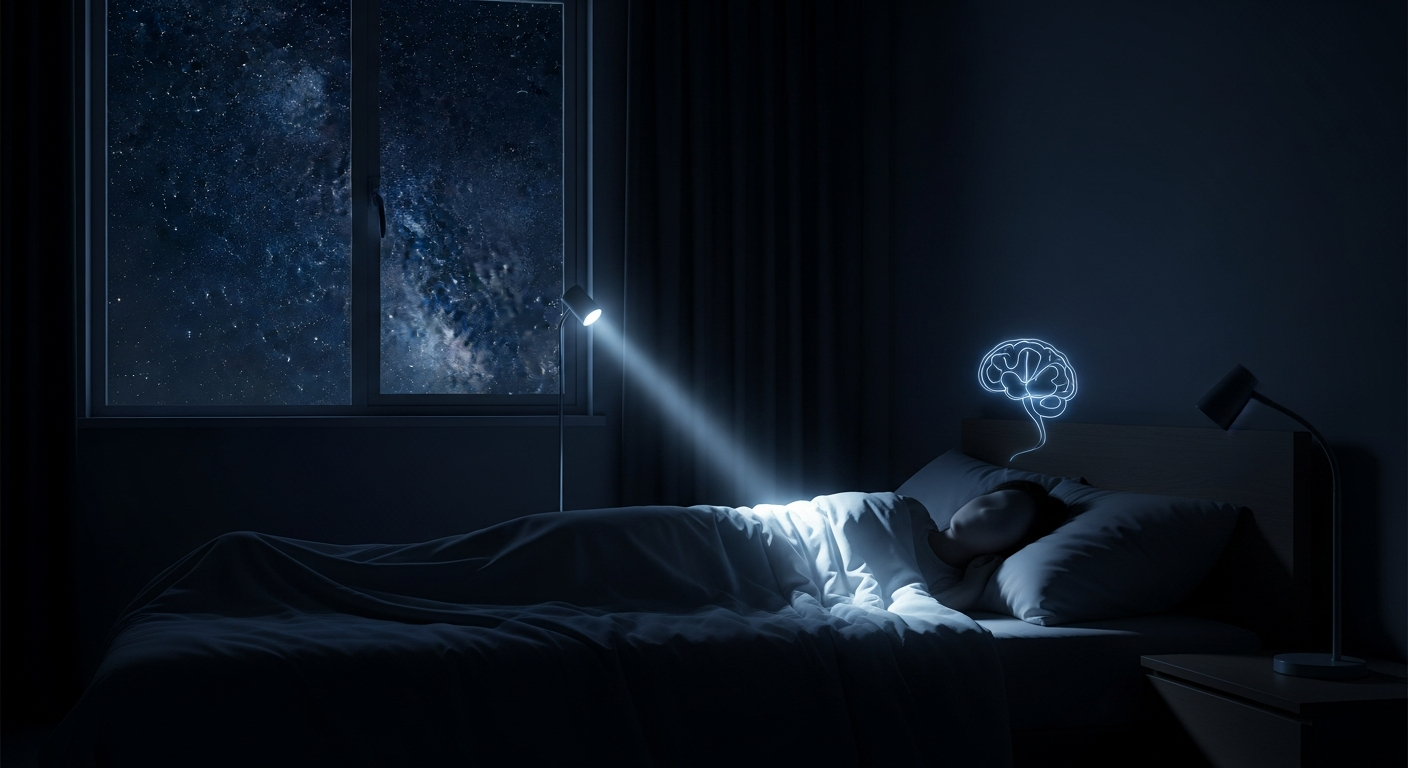
1. When your lamp tells your brain to wake up
In this study, narrow bands of blue light at night almost completely switched off melatonin, the hormone that helps you feel sleepy. The same brightness at other wavelengths had a much weaker effect. It shows that a thin strip of blue in your evening light can act like a daytime signal, long after dark.
2. A second lab, the same uncomfortable truth
Another group ran the experiment their own way, using different kit and different volunteers. They still found that a very specific band of blue light is what your body clock listens to when deciding whether to release melatonin or hold it back. Change the spectrum and you change the timing of your internal night.
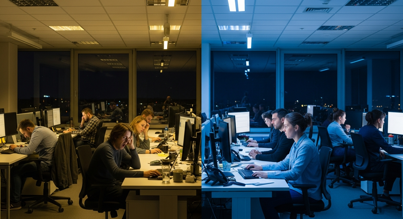
3. Night workers felt less like ghosts
Night-shift workers were randomly assigned to either standard office lighting or a blue-enriched spectrum. The people under the blue-enriched lights reported less sleepiness and performed better on some tasks in the early-hours slump. Same job, same hours – but the spectrum meant the difference between feeling barely present and feeling switched on.
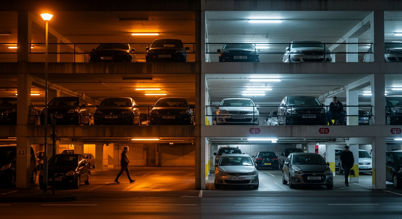
4. Two car parks, same intensity, one less safe
Five different lamps were set to the same measured luminance. On paper they were equal. In reality, lamps with more short-wavelength content let people see contrast more clearly and react more quickly, especially at lower light levels. Imagine walking through a dim car park: one light makes everything blur into grey; another lets you see shapes and faces in time. The spectrum is the difference.

5. The hidden cost of chasing "efficient" light
This review pulls dozens of studies together and shows a common thread: tweak the spectrum and you don't just change colour rendering, you change comfort, perceived brightness and circadian stimulation. A light can tick the efficiency box on paper yet leave people washed-out, uncomfortable and biologically overstimulated.
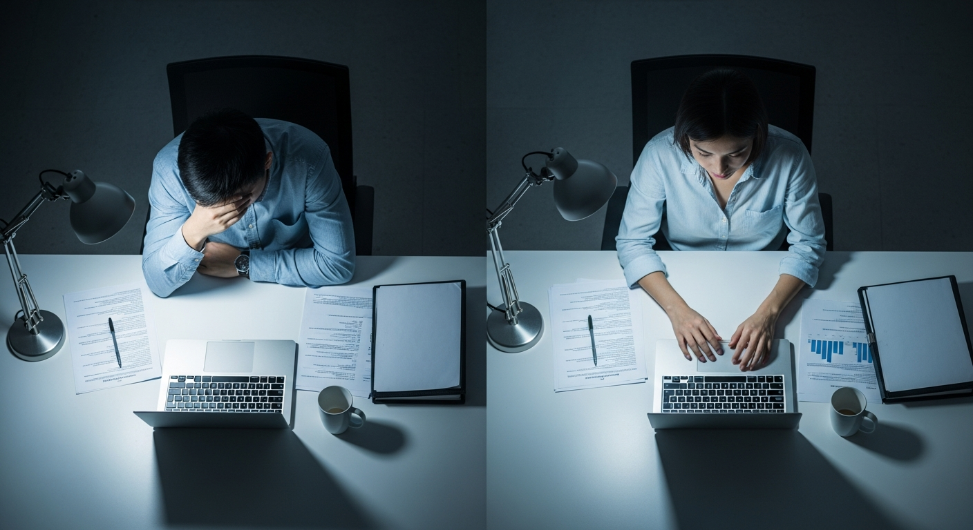
6. Why some lights leave you feeling wrung out
Volunteers worked on paper and computer tasks under different combinations of brightness and colour temperature. Mid-range brightness with a moderately cool spectrum led to less reported fatigue and better comfort than harsher or dingier mixes. Same tasks, same time at the desk – but under the wrong light people felt as though their eyes had done a much longer day.

7. Light that makes your room feel dead – or alive
In these experiments, people simply rated how pleasant colours looked under different LED spectra. Some lights consistently made faces and objects look flat, sallow and "off". Others made the same scene look rich and natural. Nothing else changed – only the spectrum – yet the mood and appeal of the room shifted completely.
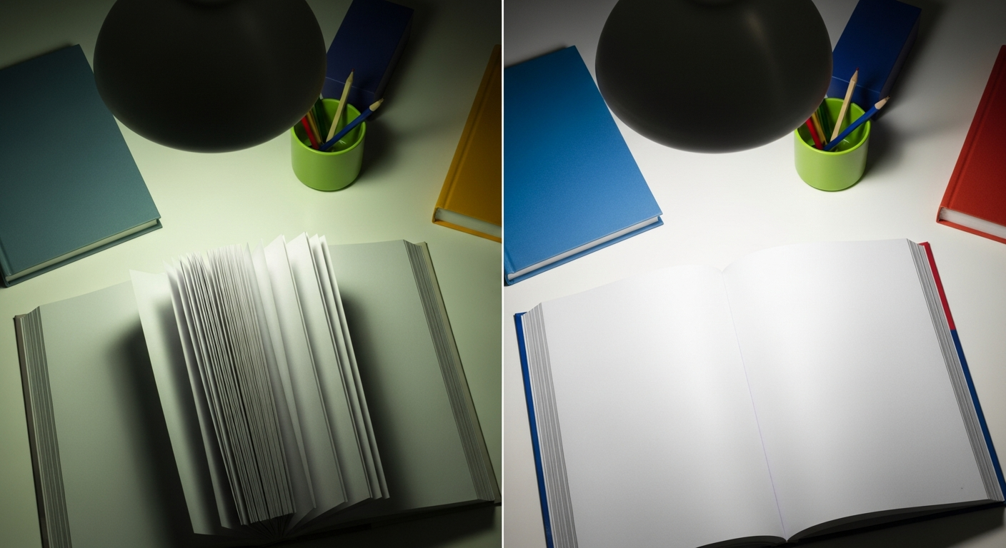
8. When "cheap LED" turns whites grey
This study compared two LED sources with very similar colour temperature but different colour rendering (CRI 85 vs 97). People strongly favoured the high-CRI light. Whites looked cleaner, colours looked more natural and the whole scene felt "right". It is the familiar story: the bargain LED that makes everything look a bit ill, versus the one that brings text and colour back to life.
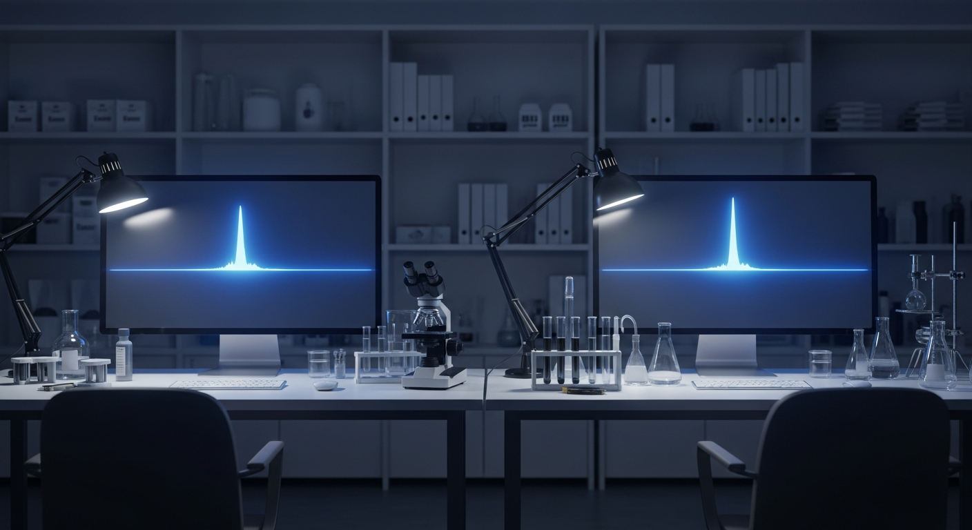
9. Brain waves give away how tiring the light is
Participants read under various combinations of brightness and spectrum while their brain activity was recorded. Reading speed, accuracy and EEG markers of fatigue all changed with the lighting. Some mixes let people keep going longer before their brain showed signs of strain; others wore them out faster, even when the page looked "bright enough".
10. Every light impacts your body clock
Using a large integrated model, this work shows how the same spectrum that shapes visual qualities like colour rendering also drives non-visual, circadian responses. You cannot tune one without affecting the other. The lamp you choose for clarity at the page is, at the same time, one of the signals your body uses to decide how awake or sleepy to feel.

Balanced, high-fidelity spectrum
These papers are a big part of why we favour a fuller, more even spectrum instead of chasing raw efficiency. Spiky, cheap spectra can be bright on a meter yet make print, faces and colours feel dull and tiring. We would rather give up a few lumens on the box than leave you staring at a grey, lifeless page.
Daylight-like profile
The circadian research shows how sensitive your body is to the shape of the spectrum, especially in the blue region. Our Daylight Wavelength Technology™ is tuned to rebuild a more natural daylight profile instead of the narrow, blue-spiked pattern of a standard LED. The aim is simple: a light that feels more like sitting by a good window than under a strip in a supermarket.
Task-appropriate intensity
The performance and fatigue studies point in the same direction: enough light at the page, with the right spectrum and the ability to adjust it, matters more than headline lumen numbers. That is why we focus on usable light on your task, with smooth dimming and beam control, rather than simply boasting about maximum output.
None of these papers were funded by Serious Readers. Any mistakes in how we've summarised them are ours, not the authors'. They don't prove that any one light will help every person – but they do show why spectrum is too important to ignore.
The science explains why the spectrum matters. The question that counts is much simpler:
Can a better spectrum make it easier for you to read, sew, work or simply enjoy an evening without your eyes giving up first?
The only way to know is to sit in your own chair, with your own book or hobby, under a light that's been built with this evidence in mind.
HD Pro
More powerful beam, adjustable width, cordless upgrade available.
- Adjustable beam width
- Separate thumb-wheel dimming
- Ready for cordless and remote upgrades
HD Essential
Wide even beam, simple dimming. Everything you need for comfortable reading.
- Wide, even beam
- Simple dimming
- Hand-built in Great Britain